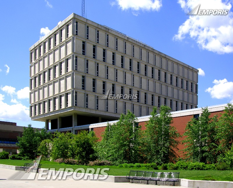
Back in the day when I attended the University of Wisconsin Milwaukee (fall of 1970 through December 1973), Bolton Hall was a free standing class room and office building. It was relatively new having been completed in 1964. It faced the grassy quad area north of Kenwood Boulevard and was north east of the original Student Union. Although not quite a brutalist building, it was certainly a design product of the period.
Today it is connected to the expanded Student Union. And instead of leaving one building to access the other, today you can access Bolton Hall from the Union via a glass enclosed walkway and there’s the rub. The walkway is visible in this contemporary photo of the building taken from the Spaights Plaza, a concrete expanse that replaced the green space during the Union expansion when a two level underground parking structure was built as part of the expansion.

The approach area to Bolton Hall from the south (the Union and Kenwood Boulevard) include a series of what apparently are cast concrete panels with an organic pattern incised into them. These panels appear on the south side at ground level facing the addition to the Student Union (which was completed in 1973 I think but I haven’t documented that at this time) and on the southeast entrance to the building. I have been on campus a bit over the past few years but haven’t walked around the building so I don’t know if this decorative motif adorns other entrance areas.
But here are few views of the southern exposure facing the Student Union. Quite a nice motif at ground level for an otherwise rather faceless building.

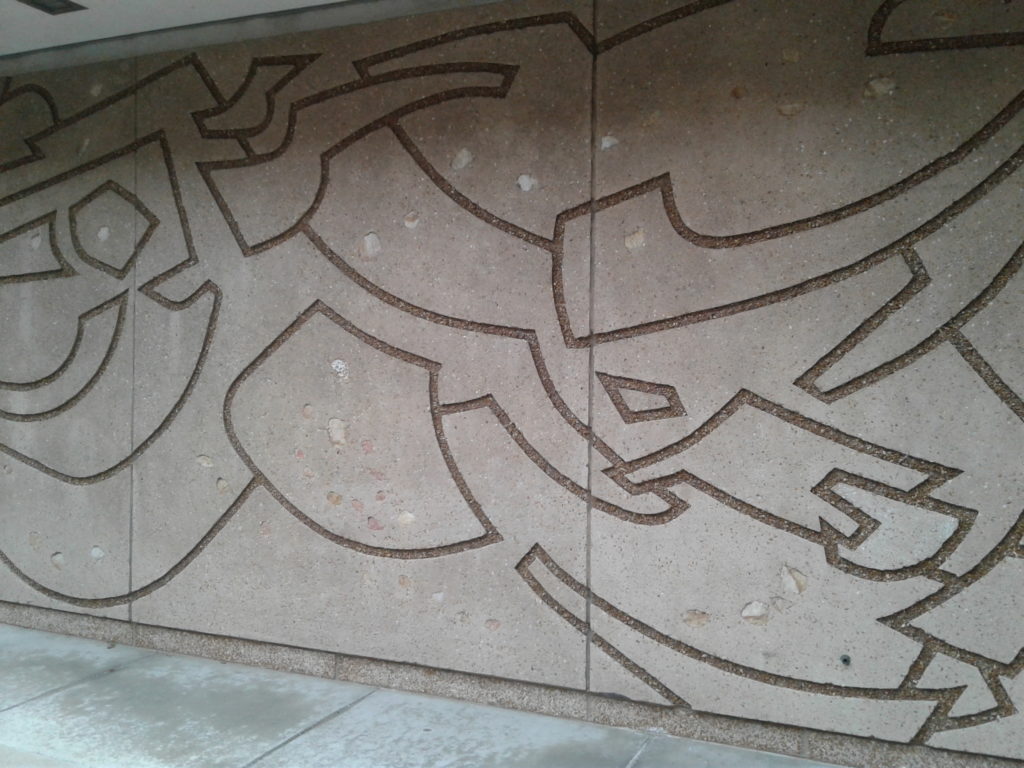
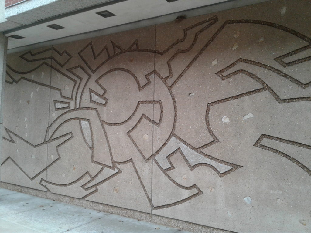
These are still outdoors along a little used walkway but clearly visible from the food court seating area in the Student Union. So they are still being seen as they were meant to be seen for the most part. Although of course the space is confined compared to when there would have been open space south of the building back in 1964.
Now there are similar decorative panels at the south east entrance to the building that are enclosed in the glass atrium walkway. So you’d expect them to fair better being out of the elements and maybe they would…if not for the callous intervention of mankind. Here, take a look and you will see what I mean.
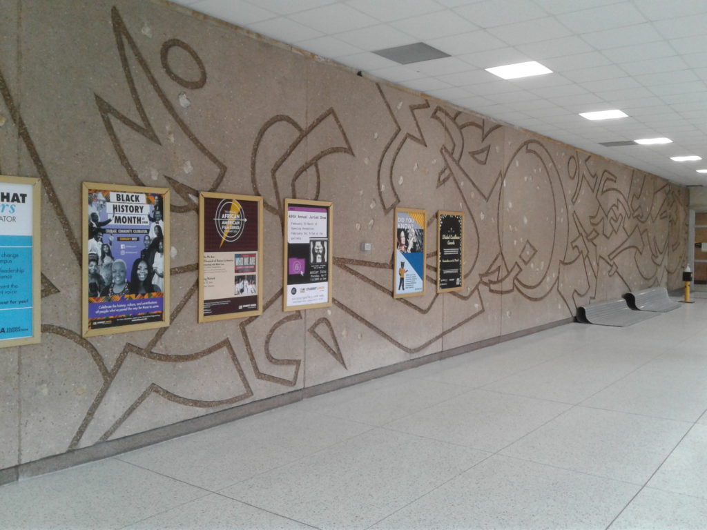
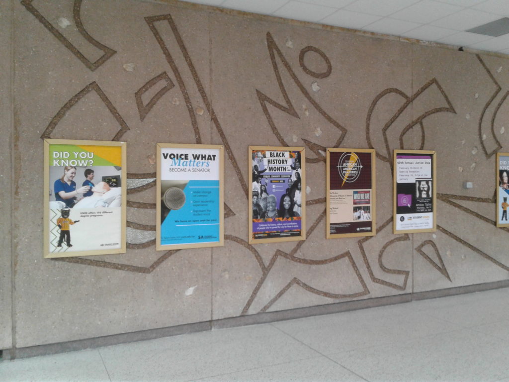
These poster frames are simply screwed into the concrete panels, totally disrespecting the integrity of the art work and the architecture. And they don’t really need these posters here. The university posts similar media on the the glass windows of the walkway and the Student Union on a continuing basis and being a high traffic area no one stops to read these anyway. I know, I had to work quickly to avoid including students in my photos…and the quality and focus suffered as a result. The following photo is the northern portion of the series without any disfigurement. I didn’t check to see if the was any sign of previous posters or frames.
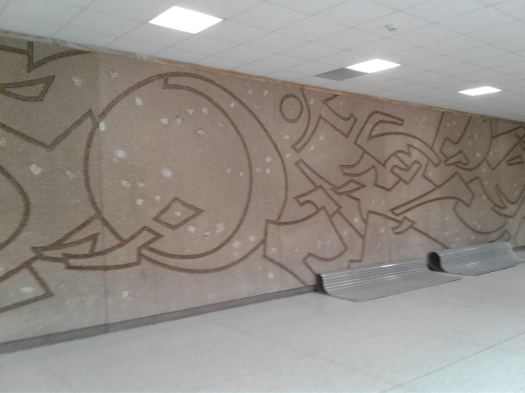
I don’t quite get the cavalier attitude that the university has taken in regard to this art work. They have carefully maintained any number of old…including very old buildings on the old Downer campus and of course the venerable Mitchell Hall. So they still work as comfortable classroom buildings. Why the careless disregard for this one…well…particularly the artwork meant to enhance the building and the student experience?
I majored in the visual arts and was urged to attend UWM because of their outstanding fine arts program. I loved my experience there so I don’t understand how this could happen. Was there or was there not any complaints from the art department or art faculty. And UWM also has a world class architecture school. Didn’t they notice the disrespect shown for a key building on their own campus?
I urge UWM to remove the frames and perform any restoration necessary…let these concrete murals speak for themselves…unblemished!…unhindered!
And one more photo from another vantage point. This one is from the north east portion of Spaights Plaza.
